
Machine Learning with Python in Excel Part 5: Decision Trees
Use ML to interpret ML for more impact at work.

Are you new to this tutorial series? Check out Part 1 here.
This week’s issue is the fifth in a tutorial series demonstrating how Microsoft is positioning Excel as the do-it-yourself (DIY) analytics platform of the future.
This week’s tutorial builds upon Part 3 and Part 4 of the series - be sure to check them out if you haven’t already read them.
If you want to follow along by writing code (highly recommended), you can get the PythonInExcelML.xlsx workbook from the newsletter GitHub repository.
On to the tutorial...
Using ML to Interpet ML
Part 3 of this series demonstrated one of the most useful of all DIY data science skills - cluster analysis.
The value of cluster analysis skills is two-fold:
Cluster analysis is useful for any professional working in non-profit, government, healthcare, or for-profit organizations. It’s truly a universal skill.
Interpreting cluster analyses for business stakeholders is still a human-centric skill, even in the age of AI.
While in the past this sort of work was firmly in the domain of technical roles like Data Analysts/Scientists, Python in Excel has changed everything.
For example, the Copilot in Excel AI will often generate Python code for cluster analysis in response to a prompt. However, Copilot isn’t very good at interpreting the clusters. This is an opportunity for you to stand out at work.
Today’s tutorial will focus on using a decision tree predictive model to interpret cluster analyses.
Yes, you read that correctly. Using machine learning (ML) to interpret ML.
If you’re new to all of this, be sure to check out my Cluster Analysis and Decision Tree ML live crash courses to jumpstart your real-world ML skills.
Prepping the Data
The first step is to remove the cluster assignments added in Part 4:
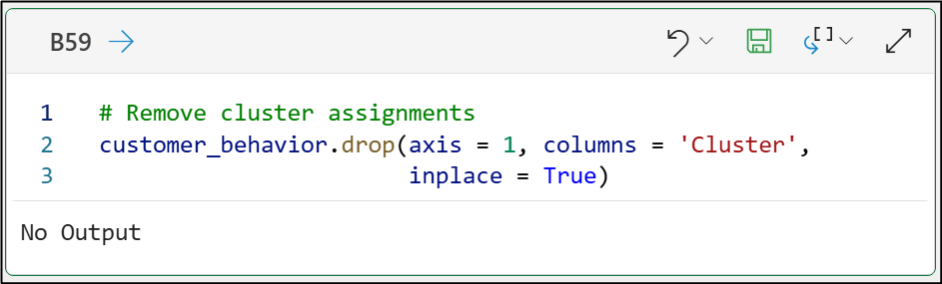
And here’s the Python code for your Excel workbook:
# Remove cluster assignments
customer_behavior.drop(axis = 1, columns = 'Cluster', inplace = True)
Training the Decision Tree
One of the best things about machine learning algorithms based on decision trees is that you don’t have to scale your numeric features.
So, the decision tree can be built (i.e., trained) using the original customer_behavior dataset. This allows for easy interpretation of the decision tree model for your business stakeholders.
The following code trains the decision tree model:
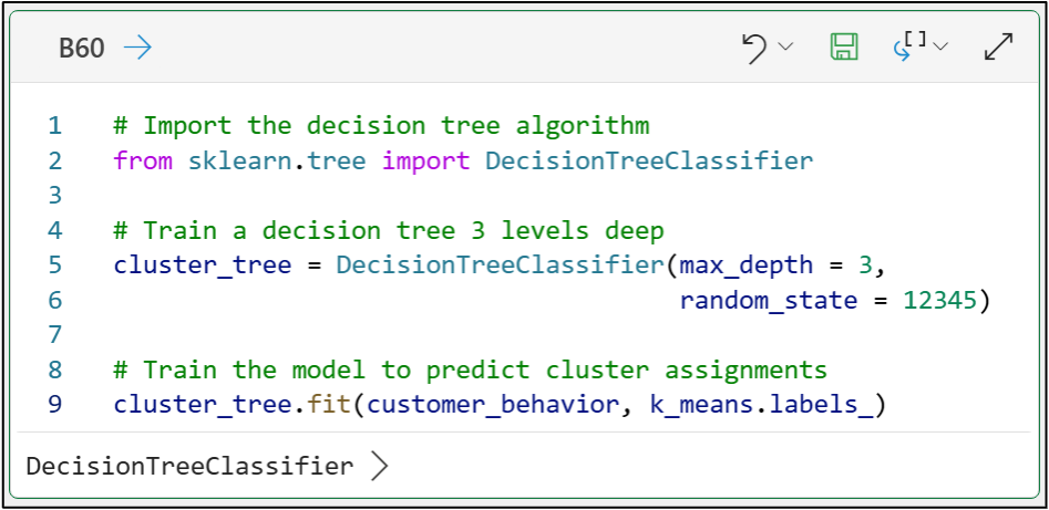
The above code demonstrates a critical idea for using ML to interpret your clusters: the model must learn to predict cluster assignments (i.e., labels).
Here’s another critical idea in using ML models to interpret your clusters:
If you can train a machine learning model that is both interpretable and accurate at predicting cluster assignments, it can be useful for communicating cluster findings to your business stakeholders.
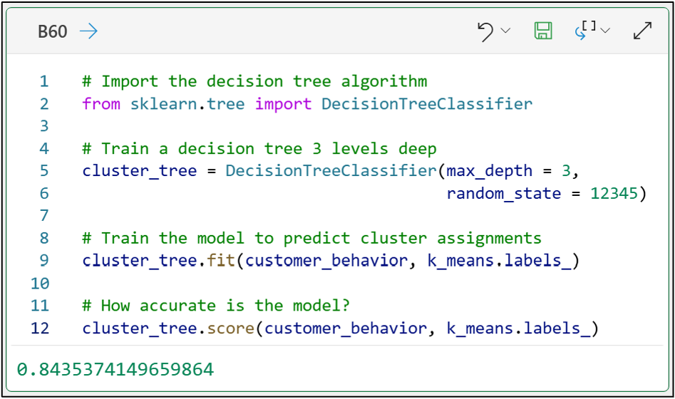
Let’s update the above code to include scoring the model’s predictions:
# Import the decision tree algorithm
from sklearn.tree import DecisionTreeClassifier

# Train a decision tree 3 levels deep
cluster_tree = DecisionTreeClassifier(max_depth = 3, random_state = 12345)

# Train the model to predict cluster assignments
cluster_tree.fit(customer_behavior, k_means.labels_)

# How accurate is the model?
cluster_tree.score(customer_behavior, k_means.labels_)
The output above shows that the model is 84.35% accurate at predicting cluster labels.
This output shows the tradeoff of using ML models for cluster interpretation:
More complex models (e.g., a decision tree that’s 9 levels deep) will usually be more accurate.
More complex models lead to more complex interpretations - which might not resonate so well with your business stakeholders.
If you’re new to Python, my Python for Excel Users crash course will show you how your Microsoft Excel skills make learning Python easy.
Visualizing the Decision Tree
My experience has been that a 3-level decision tree model with 84% accuracy is a reasonable trade-off and provides useful cluster interpretations.
Decision trees can be very useful for interpreting clusters because, at 3 levels of depth, their visualizations are easy for your business stakeholders to understand.
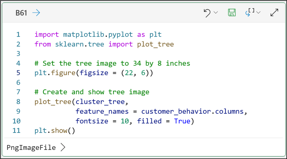
The following code creates a visualization of the decision tree model:
import matplotlib.pyplot as plt
from sklearn.tree import plot_tree

# Set the tree image to 34 by 8 inches
plt.figure(figsize = (22, 6))

# Create and show tree image
plot_tree(cluster_tree, feature_names = customer_behavior.columns, fontsize = 10, filled = True)
plt.show()
Clicking PngImageFile > in Excel's Python Editor displays the decision tree model:
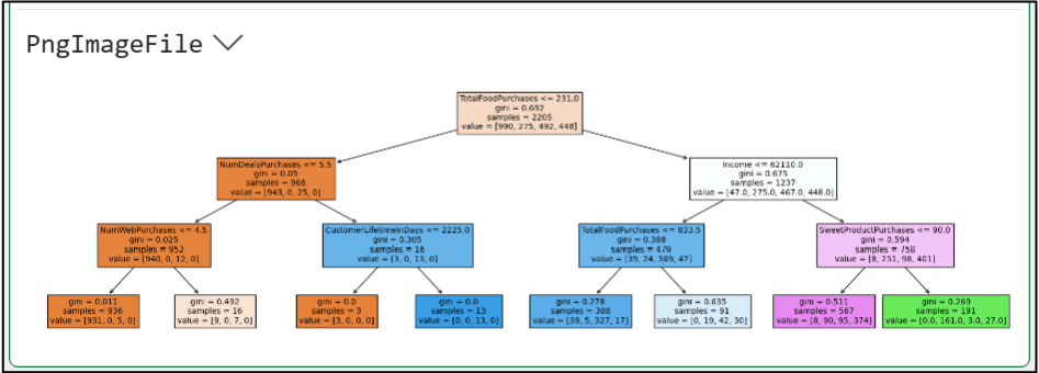
Unfortunately, this image is too small to be useful. We can ask Python in Excel to output the image directly to the worksheet so we can enlarge it:
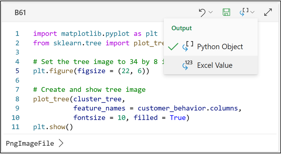
Selecting Excel Value from the Output drop-down in the Python Editor will then output the image in the worksheet cell:
Luckily, Excel allows us to enlarge the image quite easily by right-clicking the output cell:
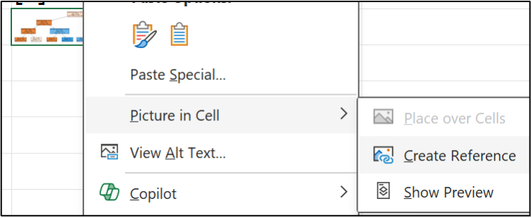
The image is now enlarged and easy to read:
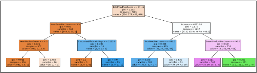
While the image looks small here, it's quite large in the Excel worksheet. 😁
Interpreting the Decision Tree
The best way to use a decision tree to interpret clusters is to examine the leaf nodes at the bottom of the tree. What you’re looking for are leaf nodes that are predominantly in one of the clusters.
The leaf node at the lower left of the decision tree is a perfect example:
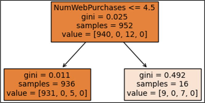
As covered in Part 3 of the tutorial, 4 clusters were mined from the data, labeled 0, 1, 2, and 3.
Here’s how you read the decision tree visualization to determine the cluster counts in the leaf nodes:
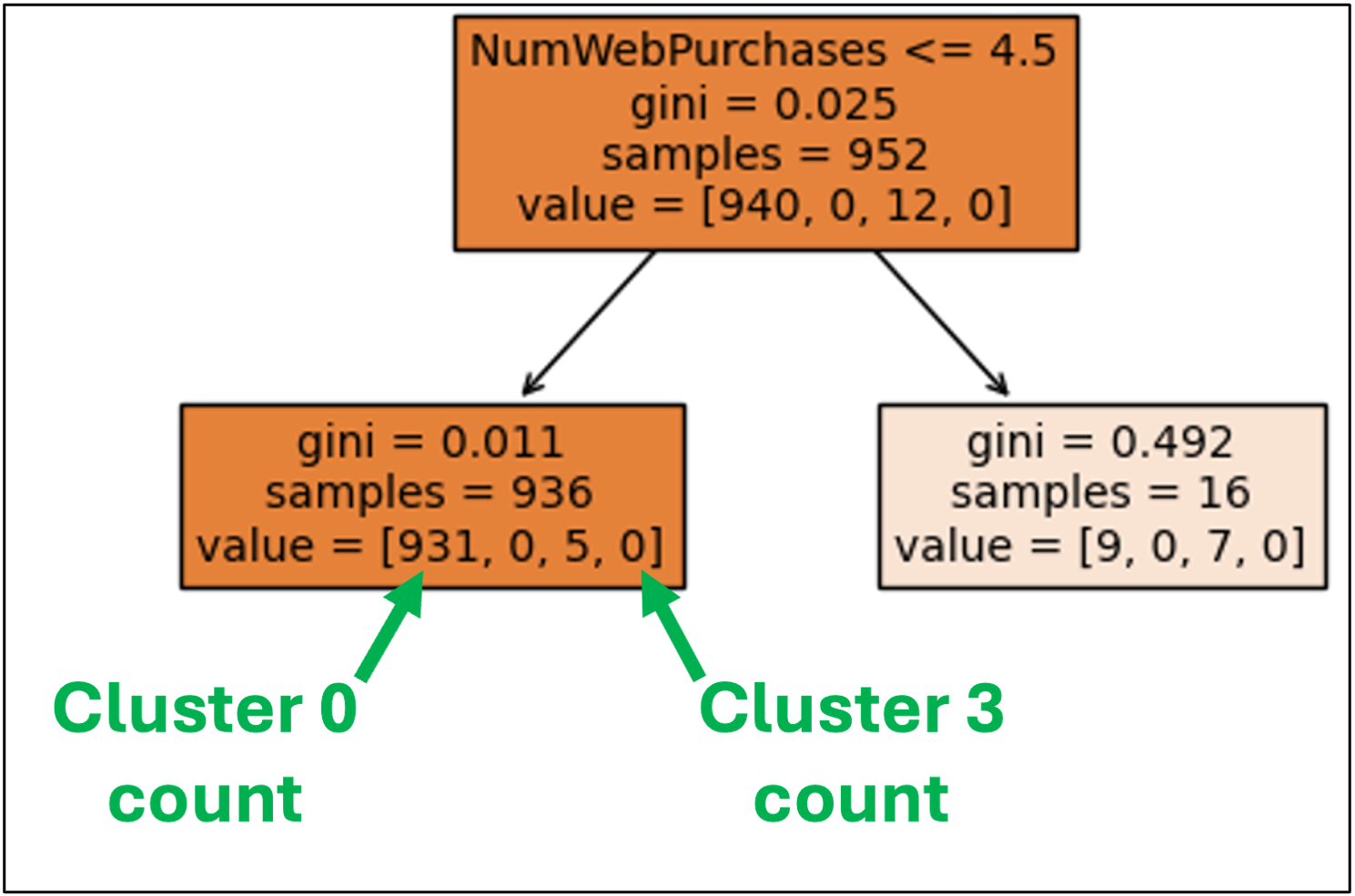
The lower left leaf node has the following counts:
931 instances of Cluster 0.
0 instances of Cluster 1.
5 instances of Cluster 2.
0 instances of Cluster 3.
This leaf node can provide us with a powerful interpretation of which customers were assigned to Cluster 0.
To do this, we need to look at all the decision nodes that lead to this leaf node:
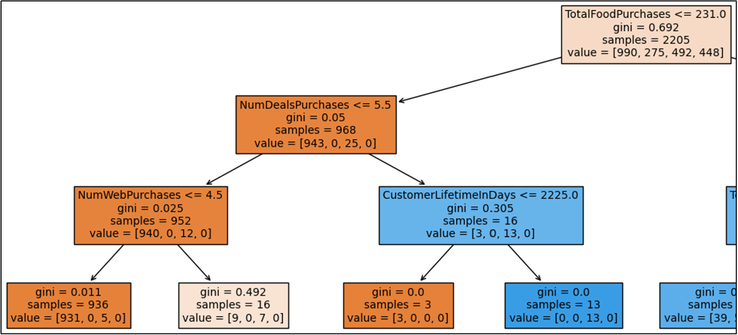
The vast majority of customers assigned to Cluster 0 had the following behaviors:
TotalFoodPurchases less than or equal to 231.
NumDealPurchases of 5 or less.
NumWebPurchases of 4 or less.
In natural language, you could explain Cluster 0 like this:
“Customers belonging to Cluster 0 typically have lower food purchases and don’t take advantage of our deals or website when they do purchase.”
DIY data scientists use cluster analysis to uncover insights like this for:
Employees
Customers
Products
Patients
Claims
Users
So, the combination of cluster analysis and decision tree predictive models is like chocolate and peanut butter - better together.
👉 Are you ready to partner with AI? Check out the prompt for this series.
That’s it for this tutorial.
The capstone of this tutorial series is coming up next - an AI prompt that you can use to partner with your favorite tool (e.g., ChatGPT) to accelerate your impact at work.
Stay healthy and happy data sleuthing!
👩🏫 Ready to Learn More Analytics Skills?
My paid subscribers have access to exclusive monthly live crash courses that include:
PDFs of all slides.
Excel workbooks, code, and data.
Recordings so you can learn on your schedule.
Check out one of my recent live crash courses:
