
Machine Learning with Python in Excel Part 4: Data Visualization
Learn why charts are for much more than dashboards.

Are you new to this tutorial series? Check out Part 1 here.
This week’s issue is the fourth tutorial of a series demonstrating how Microsoft is positioning Excel as the do-it-yourself (DIY) analytics platform of the future.
This week’s tutorial builds upon Part 3 of the series - be sure to check it out if you haven’t already read it.
If you want to follow along by writing code (highly recommended), you can get the PythonInExcelML.xlsx workbook from the newsletter GitHub repository.
BTW - If you’re getting started with machine learning, check out my Machine Learning in a Nutshell crash course.
On to the tutorial...
Job Security for Humans
Part 3 left off with the results of a common DIY data science scenario - segmenting data using cluster analysis.
In this case, the dataset is a classic marketing example - customer segmentation.
If you’re not in marketing, don’t worry.
Cluster analysis is one of the most widely used of all data science techniques. For example, the Copilot in Excel AI will often use cluster analysis to mine groupings from your data - regardless of your role or industry.
At the time of this writing, there’s another reason why cluster analysis is such a valuable skill - cluster analysis is job security for humans.
While you can certainly use AI tools like Copilot in Excel to help you interpret the cluster analysis results, AI can’t produce a full interpretation that will resonate with business stakeholders.
Also, business stakeholders get nervous when they realize that the AI interpretation of your clusters isn’t necessarily reproducible. It’s entirely possible that the AI will give you a different interpretation the next day!
So, you still need a human in the loop.
Today’s tutorial will teach you how to use data visualizations to interpret a cluster analysis.
Luckily for us, Python in Excel supports the best data visualization library for DIY data science - plotnine.
The Mighty Plotnine
While there are many data visualization libraries available in Python, Microsoft did you a solid by including my absolute favorite for doing real-world analytics - the mighty plotnine.
The plotnine library excels at visually analyzing data for two primary reasons:
It uses what is known as the grammar of graphics to make learning how to build powerful visualizations much easier.
It supports using multiple features (i.e., dimensions) simultaneously.
The second reason deserves some additional explanation.
If you’ve ever used an Excel PivotTable, then you’re familiar with adding more rows and columns to the PivotTable to allow you to “drill down” into the data. This is the feature that, more than any other, makes PivotTables useful.
As it turns out, being able to drill down into the data in your visualizations is far more powerful than PivotTables can ever be (this is why I mainly use PivotTables to feed PivotCharts, BTW).
Building on the last tutorial, the first step is to import the plotnine goodness you need:
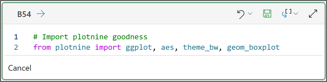
And here’s the code for your Excel workbook:
# Import plotnine goodness
from plotnine import ggplot, aes, theme_bw, geom_boxplot
You can think of the above functions as being like what you need for creating a painting:
ggplot() is like a blank canvas.
aes() defines the paints you’re using.
theme_bw() defines the painting’s style.
geom_boxplot() is the subject of the painting.
If you’re new to Python, my Python for Excel Users crash course will show you how your Microsoft Excel skills make learning Python easy.
Not surprisingly, you start with the canvas and provide it with our dataset:
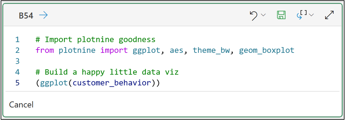
The code above demonstrates something critical in cluster analysis:
Always interpret your clusters using the original data. For example, scaled data will not be understood by your business stakeholders.
Passing the customer_behavior dataset to the ggplot() function provides the raw materials you need for our painting.
Next, you use aes() to define the paints.
But, before you can do that, you need to add the cluster assignments to the original data to use in the painting:
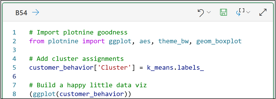
As you learned in the last tutorial, the cluster assignments are simply the numbers 0, 1, 2, and 3.
The clustering algorithm (i.e., k-means) has no idea what these assignments mean in real-world business terms. This is where you add value to the process.
Python technically “sees” the cluster assignments as numbers, when in fact they are categories.
You can take this into account when you define the paints using aes():
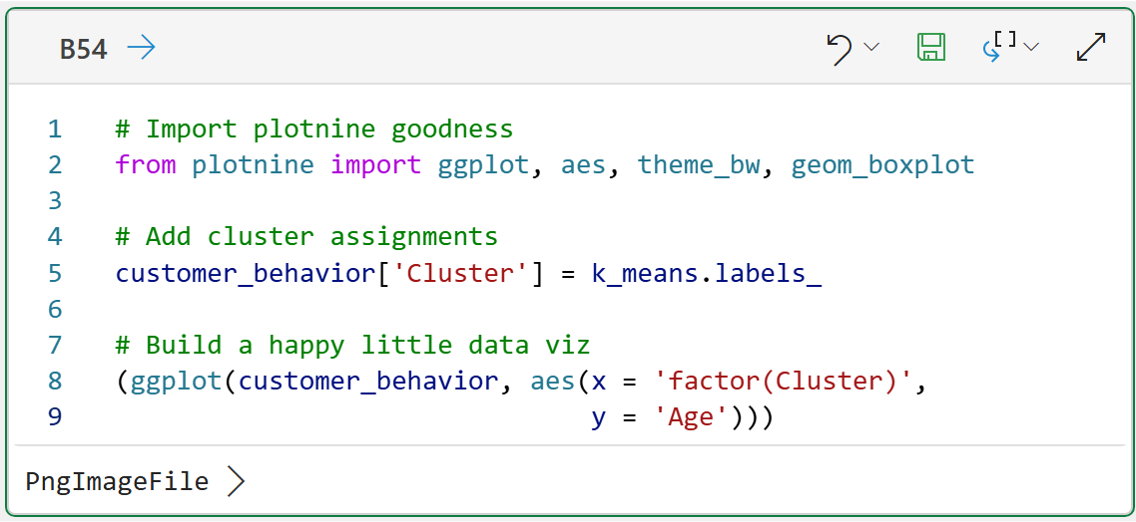
I’ve broken the call to the aes() function over two lines to demonstrate a couple of things:
The paints to use (i.e., the Cluster and Age features).
Using factor() to tell plotnine to treat Cluster as categorical data.
With the canvas and paints defined, you can now add in the style (i.e., theme) of the painting:
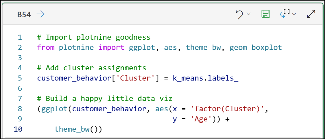
The theme_bw() function applies a simple black-and-white theme to the painting.
When creating visualizations for data analysis, you typically want to use minimal colors, as they are more distracting than helpful.
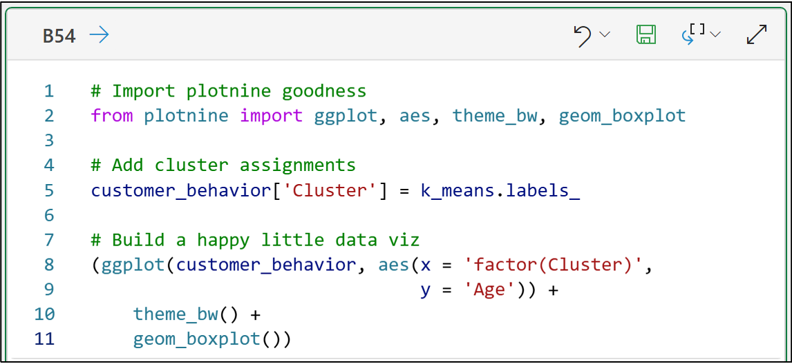
Next, you define what you want to paint. In this case, a happy little box plot:
# Import plotnine goodness
from plotnine import ggplot, aes, theme_bw, geom_boxplot

# Add cluster assignments
customer_behavior['Cluster'] = k_means.labels_

# Build a happy little data viz
(ggplot(customer_behavior, aes(x = 'factor(Cluster)',
                               y = 'Age')) +
    theme_bw() +
    geom_boxplot())
Notice the plus (i.e., +) symbols in the code above?
Think of the plusses as telling plotnine that you would like to add layers to the painting:
ggplot() is the canvas (base layer).
theme_bw() is layered on top of the canvas.
geom_boxplot() is layered on top of the theme.
This layering approach makes using plotnine to build your visualizations very intuitive.
A Happy Little Box Plot
When creating data visualizations with Python in Excel, it's often convenient to output the visualization to the worksheet so that you can size it as you see fit:
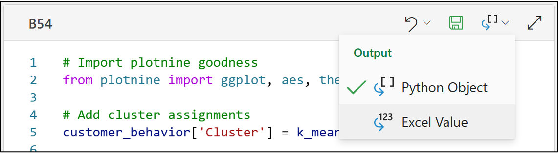
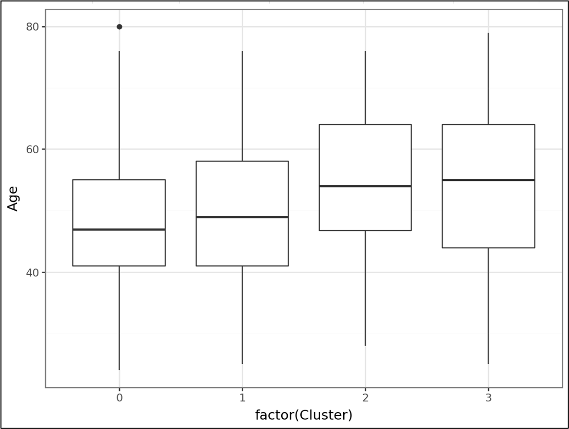
And voila! When you save (i.e., run) the Python formulas, you get a happy little box plot:
To see the above in the worksheet, be sure to right-click on the cell and select:
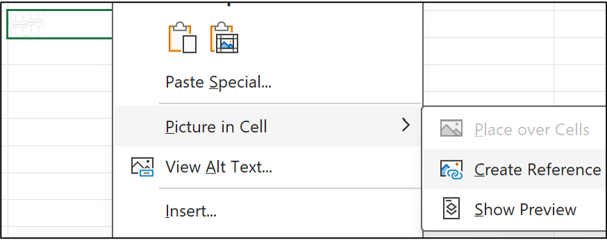
The box plot shows the distribution of customer Ages by their cluster assignment. In general, the Ages are similar across clusters, with Ages typically slightly higher in clusters 2 and 3.
When you’re done looking at the visualizations, select Undo (e.g., Ctrl+Z) to remove the reference.
One of the things that makes plotnine so great for DIY data science is how quickly you can create new visualizations.
Faster Data Visualizations
For example, you can copy the above code, paste it into a new Python formula cell, and tweak it to look at the Income feature in a matter of seconds:
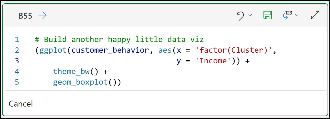
# Build another happy little data viz
(ggplot(customer_behavior, aes(x = 'factor(Cluster)',
                               y = 'Income')) +
    theme_bw() +
    geom_boxplot())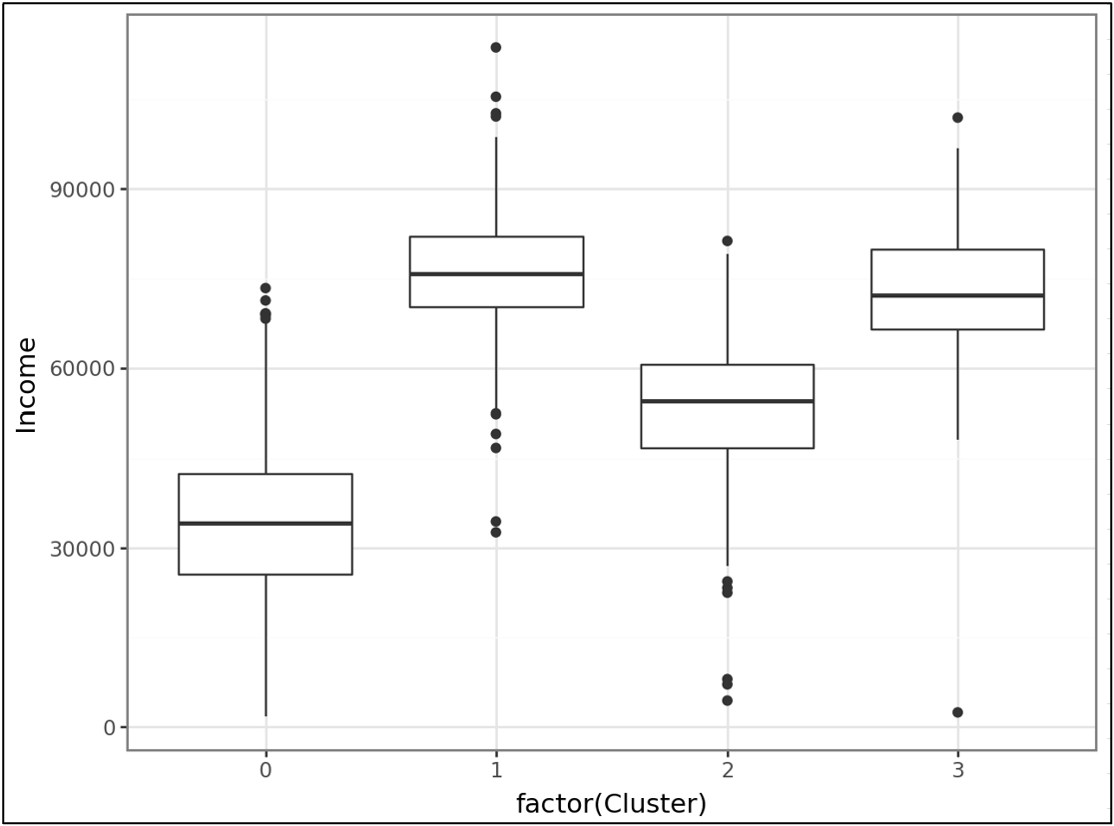
The above visualization shows an important interpretation of the clusters:
Clusters 1 and 3 have the highest Incomes.
Cluster 2 has lower Incomes than clusters 1 and 3.
Cluster 0 has significantly lower Incomes than the other clusters.
Using copy-and-paste reuse, it’s easy to explore each of the features using box plots to build the interpretations of the clusters in business terms.
However, a more advanced analysis is to explore correlations between features by cluster.
Feature Correlations by Cluster
Your go-to visualization for correlation analysis is a scatter plot:
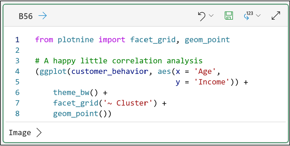
from plotnine import facet_grid, geom_point

# A happy little correlation analysis
(ggplot(customer_behavior, aes(x = 'Age',
                               y = 'Income')) +
    theme_bw() +
    facet_grid('~ Cluster') +
    geom_point())
The code above adds two new functions into the mix:
geom_point() is how you create scatter plots.
facet_grid() is why plotnine is my go-to data visualization library.
You can think of facets as a means of creating “mini-visuals” based on the unique values of a feature. Facets are what make plotnine, IMHO, the best data visualization library for DIY analytics.
The above code creates a scatter plot (i.e., a geom_point()) for every unique value of the Cluster feature:
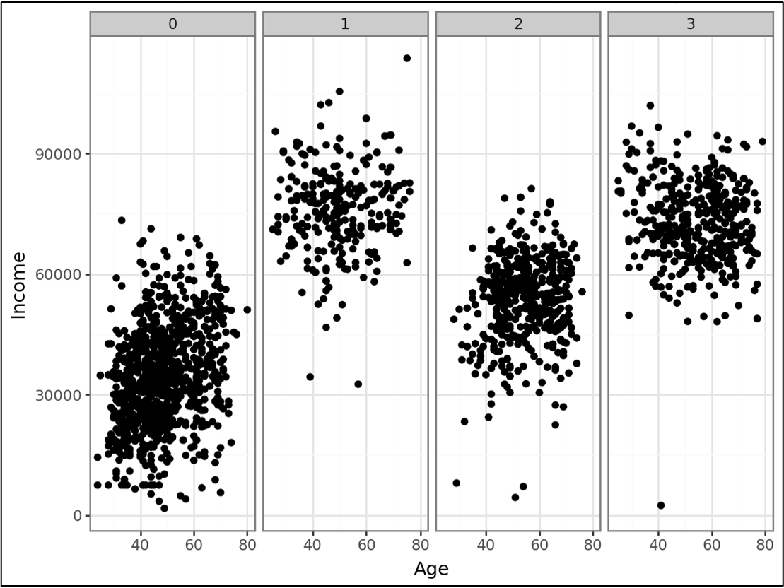
The above faceted scatter plot shows the following correlations between Age and Income:
A strong positive correlation for cluster 0.
A weak positive correlation for cluster 1.
A moderate positive correlation for cluster 2.
A weak negative correlation for cluster 3.
Once again, you can quickly evaluate the correlations between features using copy-and-paste reuse of your plotnine code.
Visual data analysis is a powerful way to interpret cluster analysis results in terms your business stakeholders can understand.
👉 Ready to learn more? Check out Part 5 here.
If distribution analysis (e.g., box plots) and correlation analysis (i.e., scatter plots) are new to you, my Visual Analysis with Python online course will teach you - fast.
That’s it for this tutorial.
My next tutorial in this series will introduce you to a next-level way to interpret your clusters - using a machine learning predictive model. 😮
Stay healthy and happy data sleuthing!
👩🏫 Ready to Learn More Analytics Skills?
My paid subscribers have access to exclusive monthly live crash courses that include:
PDFs of all slides.
Excel workbooks, code, and data.
Recordings so you can learn on your schedule.
Check out one of my latest live crash courses:
