
Machine Learning with Python in Excel Part 3: Customer Segmentation
Segmentation is a must-have analytics skill for any professional.

Are you new to the tutorial series? Check out Part 1 here.
This is the third in a series demonstrating how Microsoft is positioning Excel as the do-it-yourself (DIY) analytics platform of the future.
While this tutorial focuses on customer segmentation, don’t make the mistake of thinking that segmenting data is only useful to marketing professionals.
At base, segmentation is about mining groups directly from a dataset. This is useful for any professional when you consider you can mine groups of:
Customers
Patients
Claims
Loans
Users
The list is endless.
If you want to follow along by writing code (highly recommended), you can get the PythonInExcelML.xlsx workbook from the newsletter GitHub repository.
BTW - If you’re getting started with machine learning, check out my Machine Learning in a Nutshell crash course.
On to the tutorial...
What Is Segmentation?
When you segment your data, you aim to craft groupings that provide valuable insights to inform changes to business processes/behaviors.
A classic example comes from marketing - customer segmentation.
Customer segmentation is used by marketing teams to:
Improve existing advertising campaigns.
Inspire new marketing strategies.
Identify optimal channels.
Optimize ad copy.
Skills with segmentation are wildly useful for any professional - especially in the age of AI. For example, Copilot in Excel will suggest segmentation in response to data analysis prompts.
In the context of machine learning, segmentation is a class of unsupervised learning algorithms. More specifically, clustering algorithms.
To continue the Copilot in Excel example, I’ve spent hours testing it to see how useful it might be for real-world DIY analytics.
In all my testing, when Copilot in Excel performs segmentation on your behalf, it defaults to the k-means clustering algorithm.
The reasons for this aren’t surprising. K-means is:
Easy to understand, requiring only middle school math.
It’s surprisingly effective across industries and business domains.
Because k-means is so useful to any professional, I created a crash course to jumpstart your k-means skills.
Loading the Dataset
While this tutorial uses a customer segmentation example, everything covered applies to any segmentation you might perform (e.g., healthcare).
I’m going to repeat this throughout the tutorial series because it’s so important:
99% of the Python in Excel code you write is the same as any other Python technology (e.g., Jupyter Notebook).
To see k-means clustering in action using Python in Excel, the first step is to load the dataset:
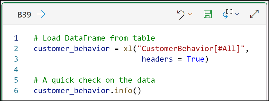
And here’s the Python code for your Excel workbook:
# Load DataFrame from table
customer_behavior = xl("CustomerBehavior[#All]",
                        headers = True)

# A quick check on the data
customer_behavior.info()
NOTE - The above code is the only code in this tutorial that is Excel-specific.
If you’re new to Python, my Python for Excel Users crash course will show you how your Microsoft Excel skills make learning Python easy.
The info() method from the DataFrame class provides useful summary information about the dataset:
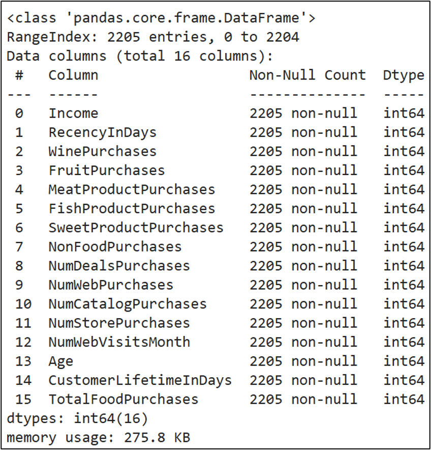
Two things in the above output are critical for performing segmentation using k-means:
All the columns (i.e., features) are numeric.
There is no missing data.
I’ll address the second bullet first. The k-means algorithm requires a complete dataset (i.e., no missing data). Even if a single cell in the dataset is missing, k-means will error out.
Regarding the first bullet, k-means relies on calculations that only work with numeric data. This is a common requirement of clustering algorithms (e.g., DBSCAN).
However, it’s common in real-world DIY data science to have both numeric and categorical features. This is known as mixed data.
If you need to segment mixed data, you need to use specialized techniques so that algorithms like k-means work correctly.
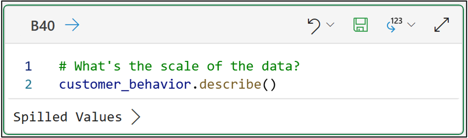
Next, you should check the data to see if anything jumps out:
# What's the scale of the data?
customer_behavior.describe()
The above Python formula is set to output to the Excel worksheet. Here's a subset of the DataFrame output:
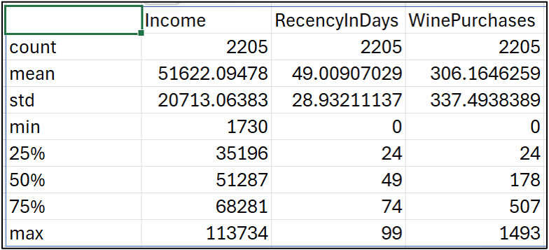
Compare the min and max rows across the columns. Notice how much larger Income values are compared to the other two features?
The technical term for this is scale. The Income feature is on a different scale compared to the other features.
Scaling the Data
Numeric features on different scales are usually a problem for clustering algorithms like k-means. The solution is to process the data so that all the features are on a similar scale.
The most common way to process the data is to use the StandardScaler class from the scikit-learn library:
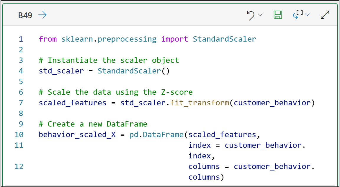
from sklearn.preprocessing import StandardScaler

# Instantiate the scaler object
std_scaler = StandardScaler()

# Scale the data using the Z-score
scaled_features = std_scaler.fit_transform(customer_behavior)

# Create a new DataFrame
behavior_scaled_X = pd.DataFrame(scaled_features,
                                 index = customer_behavior.index,
                                 columns = customer_behavior.columns)
The StandardScaler class computes the Z-score for each numeric feature.
If you’re unfamiliar, here’s a summary of the Z-score:
Calculate the mean (average) value for each feature.
Calculate the standard deviation for each feature.
Subtract the mean from each feature value.
Divide by the standard deviation.
The StandardScaler class transforms the data to improve the results of k-means clustering. The transformed data will appear to lose its business meaning:
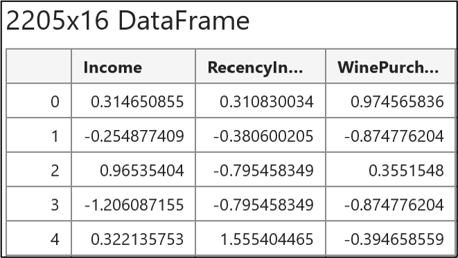
Clicking the card in the Excel worksheet displays the above preview of the transformed DataFrame.
Notice how the values are all similar, but won’t make sense to a business stakeholder?
Don’t worry, you never show the transformed data to your stakeholders, only the results of the clustering using the transformed data.
K-Means with Python in Excel
With the data transformed (i.e., standardized), it can now be segmented using k-means clustering:
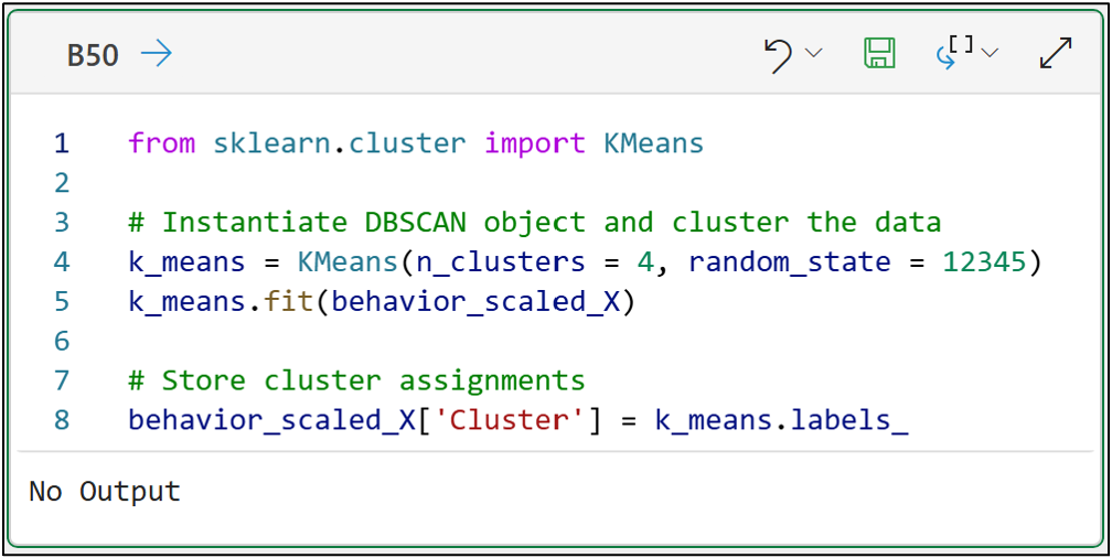
from sklearn.cluster import KMeans

# Instantiate DBSCAN object and cluster the data
k_means = KMeans(n_clusters = 4, random_state = 12345)
k_means.fit(behavior_scaled_X)

# Store cluster assignments
behavior_scaled_X['Cluster'] = k_means.labels_
To use k-means effectively, it needs to be optimized (i.e., tuned) for your dataset.
In the case of k-means, tuning takes the form of choosing an optimal number of clusters for k-means to mine from your dataset.
The code above uses the techniques mentioned in my Cluster Analysis with Python crash course to select 4 clusters to mine from the dataset.
The last line of code accesses the labels_ attribute of the k_means object. This attribute contains the cluster assignment for each row of the dataset.
By adding the cluster assignments to the transformed DataFrame, you can see how many rows are assigned to each cluster:
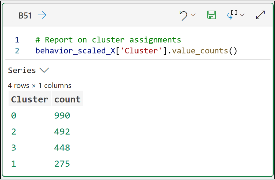
# Report on cluster assignments
behavior_scaled_X['Cluster'].value_counts()
Notice how the cluster assignments are just numbers (e.g., 0 and 1)?
Clustering algorithms like k-means only find the clusters. They do not understand the business context of the data or the mined clusters.
Therefore, clustering algorithms cannot interpret clusters to provide insights that resonate with your business stakeholders.
This is where you, as the DIY data scientist, are critical to the process - whether you use an AI like Copilot in Excel or not.
With the data assigned to clusters, the next step in segmentation is interpretation.
This is where techniques like visual data analysis come into play, helping you understand the clusters in business terms and communicate insights to your stakeholders.
Oh, and don’t think you can skip this step and just give it to AI, because no executive I’ve ever worked with will buy the following if the AI screws up the analysis:
“Don’t blame me! It’s the AI’s fault!”
👉 Are you ready to learn more? Check out Part 4 here.
That’s it for this tutorial.
My next tutorial in this series will introduce you to one of the most important tasks in applied machine learning - interpreting results with data visualizations.
Stay healthy and happy data sleuthing!
👩🏫 Ready to Learn More Analytics Skills?
My paid subscribers have access to exclusive monthly live crash courses that include:
PDFs of all slides.
Excel workbooks, code, and data.
Recordings so you can learn on your schedule.
Check out one of my latest live crash courses:
