
Machine Learning with Python in Excel Part 2: Profiling Data
Want the best ML models? You need the best data!

Are you new to the tutorial series? Check out Part 1 here.
The best machine learning (ML) models and clusterings are born of the best data. But how do you know if you have the best data?
You profile it!
Studies of data science projects reveal that 60-80% of the project effort is acquiring, understanding, cleaning, and transforming data.
My experience in the analytics trenches matches these studies. Sometimes, it’s even more!
Think of data profiling not only as a required aspect of your data science work, but also as a disproportionately valuable aspect of your work.
You want the best data for your ML models and clusterings, right?
BTW - If you’re getting started with machine learning, check out my Machine Learning in a Nutshell crash course.
Loading the Data
I’m going to repeat this throughout the tutorial series because it’s so important:
99% of the Python in Excel code you write is the same as any other Python technology (e.g., Jupyter Notebook).
If you want to follow along by writing code (highly recommended), you can get the PythonInExcelML.xlsx workbook from the newsletter GitHub repository.
You'll rely heavily on the pandas library when profiling data using Python in Excel. If you’re unfamiliar, pandas gives Python the ability to work with entire data tables - just like you do in Excel.
So, not surprisingly, the first step is to load the dataset into a DataFrame (i.e., how tables are represented in pandas):
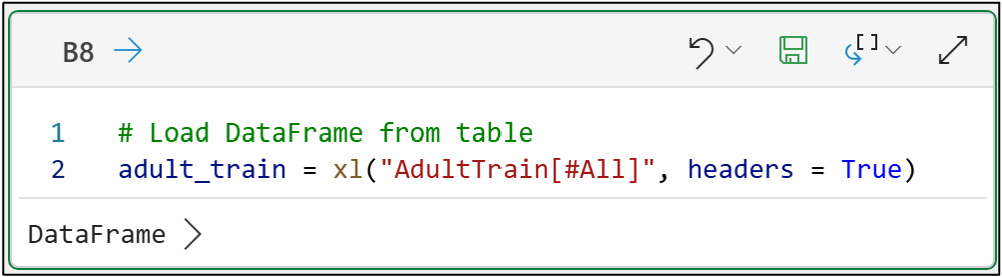
And here’s the code for your Excel workbook:
# Load DataFrame from table
adult_train = xl("AdultTrain[#All]", headers = True)
NOTE - The above code is the only code in this tutorial that is Excel-specific.
If you’re new to Python, my Python for Excel Users crash course will show you how your Microsoft Excel skills make learning Python easy.
After the data is loaded, the info() method (i.e., function) can provide you with a useful summary of what’s going on in the DataFrame:
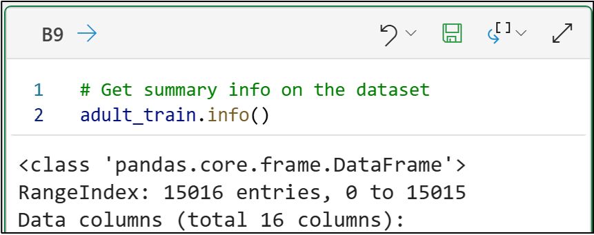
# Get summary info on the dataset
adult_train.info()
Excel’s Python Editor output above shows that the dataset comprises 15,016 entries (i.e., rows) and 16 columns.
Next, you get a breakdown of each column:
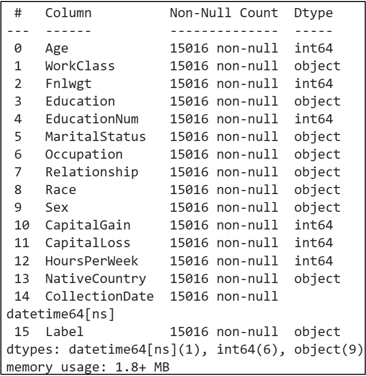
Two things in the above output are critical for crafting useful machine learning models:
The data types (i.e., Dtype) of each column in the dataset.
If there is any missing data (i.e., null values).
The output of the info() method tells us the count of non-null values for each column. This is the count of the data present.
We must compare this count to the dataset’s total number of rows to determine if any data is missing. In this case, we know there are 15,016 rows of data.
Looking at each column, we can see that no data is missing (e.g., the HoursPerWeek column has 15,016 non-null values).
This is critical because many machine learning algorithms (e.g., k-means clustering) will not work even if there’s a single missing cell (i.e., a single null value) in the DataFrame!
Profiling Numeric Features
Numeric columns (i.e., features) are common in real-world business analytics. Examples include age, counts, sales, height, weight, volume, price, duration, etc.
Because numeric features are so common, as a DIY data scientist using machine learning, making sure that your numeric features are of good quality is critical to your success.
You can get summary statistics for each numeric feature using the describe() method:
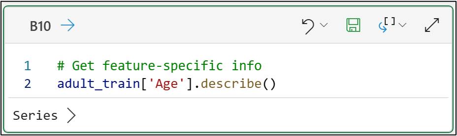
Clicking Series in the Python Editor output shows you the results:
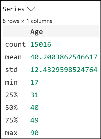
A couple of things to note in the Series output above:
The count is non-null values only.
All summary statistics ignore missing (i.e., null) values.
The DataFrames also have a describe() method that does the same across all columns at once. However, I find this less valuable because the output is much more challenging to read.
When using describe() with numeric features, you’re going to be asking yourself a few high-level questions:
Do the min and max values make sense given the business nature of the data?
Do the typical values of the mean (i.e., the average) and the 50% (i.e., the median) also make sense given the business nature of the data?
Using the Age feature as an example, you could answer the above questions like so:
Yes, the nature of the dataset is such that a min value of 17 and a max value of 90 for this feature makes sense.
For this feature, the typical values are around 40, and this makes sense given the nature of the dataset.
The next thing you must evaluate with numeric features is what is known as cardinality. That's just a fancy way of saying how many unique values are present in the numeric feature:
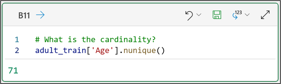
# What is the cardinality?
adult_train['Age'].nunique()
The Age feature has cardinality of 71 distinct values.
When profiling this feature for use in machine learning, you have to ask yourself a couple of questions:
Does the level of cardinality make sense given the business nature of the data?
Is there sufficient variability in the feature’s data to be useful for ML?
Regarding the second question, think of the most extreme case of low cardinality - there’s only one distinct value in the feature (e.g., the column is all zeros).
ML algorithms can’t do anything with a feature like that. It’s all the same data. There’s no signal - You must have some variation in your data for ML to learn patterns.
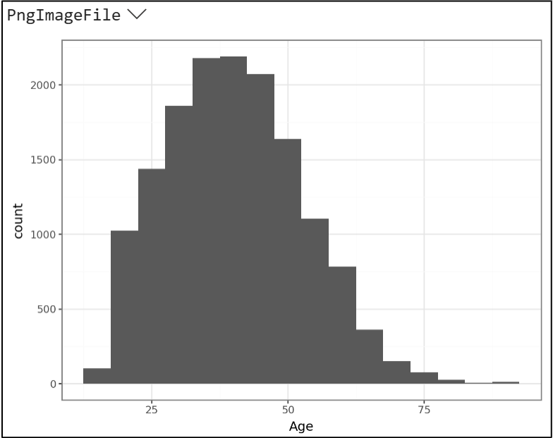
Next, you want to profile the distribution of your numeric features. The easiest way to think about this is, for a given column of numbers, how are the values spread out?
Do most values “clump” on one side or the other? In the middle?
Are there many small/large values?
Are there many zeroes?
The easiest way to see the distribution of numbers is by using a histogram. My favorite way to create histograms is using the mighty plotnine library:
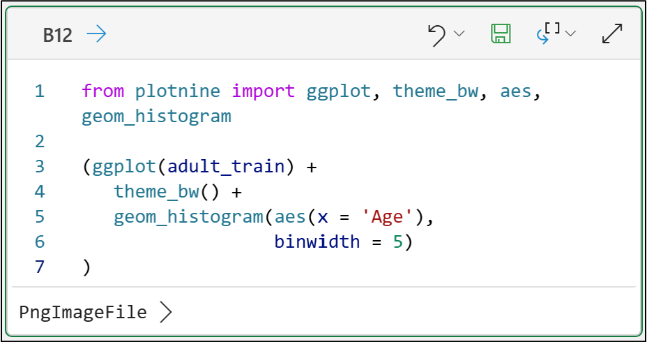
from plotnine import ggplot, theme_bw, aes, geom_histogram

(ggplot(adult_train) +
   theme_bw() +
   geom_histogram(aes(x = 'Age'),
                  binwidth = 5)
)
Clicking PngImageFile in the Excel’s Python Editor output displays the histogram:
If you’re new to visually analyzing data (e.g., using histograms), my Visual Analysis with Python online course will jumpstart your skills in a single weekend.
As you are profiling your numeric features, you should always be asking yourself this question:
“Does what I’m seeing make sense given the business nature of the data?”
Whenever the answer is “No,” you must dive into the data and discover why. This often includes speaking with business subject-matter experts.
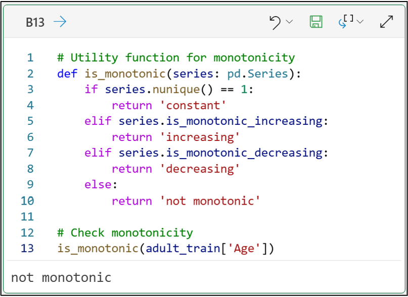
The last thing to check is whether your numeric features are monotonic. Intuitively, think of monotonic data as regularly increasing values.
For example, unique row identifiers like 10, 20, 30, 40, 50, 60, etc. are monotonic.
Monotonic data can be problematic for ML algorithms. If you see monotonic data in your dataset, you must verify that it is not a unique identifier.
NEVER use a unique identifier in your ML work!
Here's a simple utility function you can use for spotting monotonic numeric data:
# Utility function for monotonicity
def is_monotonic(series: pd.Series):
    if series.nunique() == 1:
        return 'constant'
    elif series.is_monotonic_increasing:
        return 'increasing'
    elif series.is_monotonic_decreasing:
        return 'decreasing'
    else:
        return 'not monotonic'

# Check monotonicity
is_monotonic(adult_train['Age'])
With numeric features covered, it’s time for profiling categorical features.
Profiling Categorical Features
Categorical features are far more common in business analytics than in other fields (e.g., the physical sciences). Examples of categorical data include geographies, product lines, and customer types.
The most useful real-world machine learning (ML) models typically use many categorical features. But first, you need to make sure these features should be used in your ML models.
As with numeric features, using the describe() method for categorical features should be your first stop:
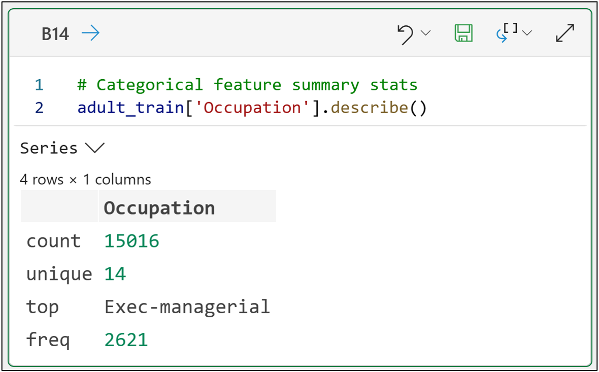
The output above provides the following information about the Occupation categorical feature:
The count of non-null values (i.e., 15,016).
The feature’s unique values (i.e., levels) - the cardinality.
The most frequently occurring level value (i.e., Exec-managerial).
The frequency of this level value (i.e., 2,621 out of 15,016).
As with numeric features, you should always be asking yourself the following about your categorical features:
“Does what I’m seeing make sense given the business nature of the data?”
If what you’re seeing doesn’t make sense, be sure to speak to a business subject-matter expert about the data (e.g., to make sure it isn’t a data quality issue).
Next, you want to look at the frequencies of the level values:
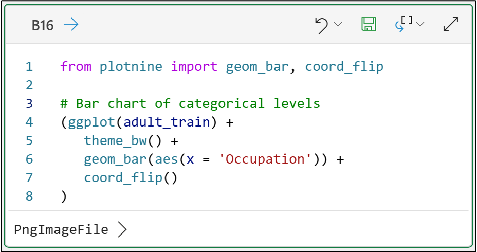
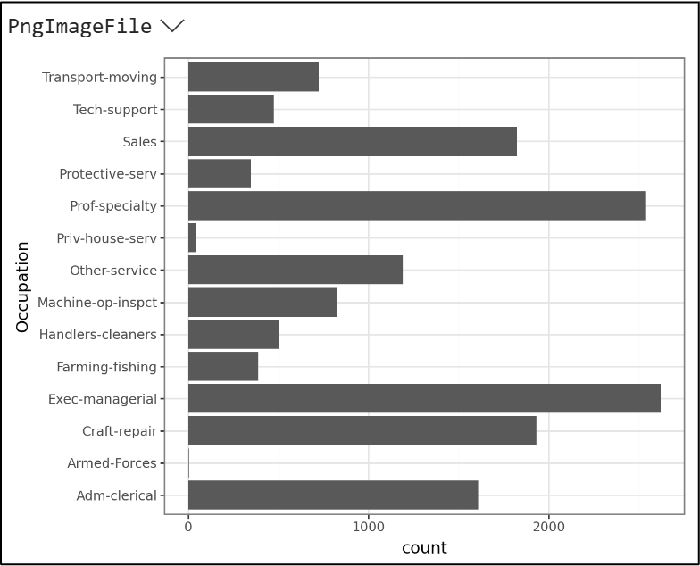
Horizontal bar charts (using coord_flip() in the code above) are among the best ways to examine the frequency of categorical levels.
Using the bar chart, you can refine your approach to profiling categorical data with more detailed questions:
Do the level values make sense, given the business nature of the data?
Are any level values far more frequent than others?
Are any level values far less frequent than others?
Do the counts of each level make sense?
For the Occupation feature, all the level values make sense. For example, the Prof-specialty level corresponds to US professions like doctors, accountants, and attorneys. Since these are relatively common occupations, you would expect this level to show up frequently in the data.
Now consider the Priv-house-serv level. It appears very rarely in the data (i.e., the bar length is very small). Rare categorical levels, like Priv-house-serv, are often problematic for machine learning algorithms - especially when using a technique like one-hot encoding.
Because of this, there’s a good rule of thumb for the cardinality (i.e., the count of levels for a categorical feature) - keep it to 35 levels or less.
Here’s the reasoning behind the rule of thumb. As the number of levels in a categorical feature increases, rare level values, such as Priv-house-serv, tend to become more frequent.
However, if you have a very large dataset, you could have more than 35 non-rare levels. In these cases, you’re likely OK with using the categorical feature “as-is.”
When you do have rare levels in a categorical feature, you can experiment with consolidating the rare levels into a custom level you create.
For example, you could create a new feature named OccupationWrangled from the Occupation feature and substitute the custom level of Miscellaneous for the following values:
Priv-house-serv
Armed-Forces
NOTE - It's best to create a new feature so you can always revert to the original if needed.
👉 Want to learn more? Check out Part 3 here.
That’s it for this tutorial.
My next tutorial in this series will introduce you to a real-world application of machine learning using Python in Excel - customer segmentation.
Stay healthy and happy data sleuthing!
👩🏫 Ready to Learn More Analytics Skills?
My paid subscribers have access to exclusive monthly live crash courses that include:
PDFs of all slides.
Excel workbooks, code, and data.
Recordings so you can learn on your schedule.
Check out one of my latest live crash courses:
