
Hierarchical Clustering with Python Part 2: The Intuition
Yes. You can learn cluster analysis even if you don't have a math or technical background. Honestly.

Are you new to this tutorial series? Check out Part 1 here.
You can think of a cluster as nothing more than a grouping of data points (e.g., rows of data in a table). At a high level, the goal of creating clusters is two-fold:
Find groups of data points that are very much alike.
Ensure the groups are as different from each other as possible.
BTW - I will use groups and clusters interchangeably in the tutorial series.
There are two strategies commonly used to perform hierarchical clustering:
Divisive is a top-down approach.
Agglomerative is a bottom-up approach.
In real-world DIY data science, agglomerative hierarchical clustering is overwhelmingly used. So, this will be the focus of the tutorial series.
This tutorial will use the same intuitive approach I use with my clients to help you understand how this bottom-up approach works - no math required.
The Starting Intuition
Imagine you work for a company that sells physical products (e.g., retail) and wants to build a taxonomy from your product data (e.g., a product catalog).
To keep the examples easy to understand, let’s assume your product data consists only of length and width measurements.
Yep. Only two columns (i.e., features).
Don’t worry.
Everything you will learn in this tutorial series applies whether you have two features or 100.
Also, since I will use visualizations in this tutorial, let’s assume the product catalog consists of only six products.
Again, this is OK because what you will learn scales to much larger datasets (e.g., 1,000,000 rows).
Here’s the data:
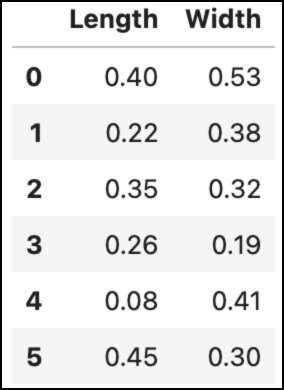
Learning how clustering techniques (i.e., algorithms) work is much easier using visualizations. Here's the above data visualized as a scatter plot:
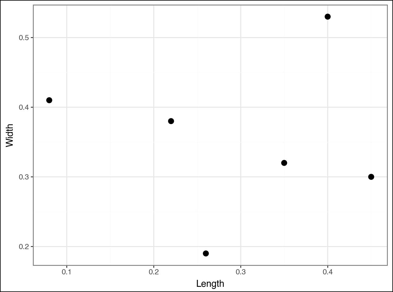
Agglomerative hierarchical clustering works by starting with each data point (e.g., row of data) and identifying which other data points are most similar.
As with most clustering algorithms, “similar” is defined as the distance between points:
Closer data points are more similar.
Distant data points are less similar.
Consider the point in the top right of the visualization. The algorithm calculates the distance (i.e., similarity) between this point and all the other points (I didn’t draw all the lines to reduce clutter):
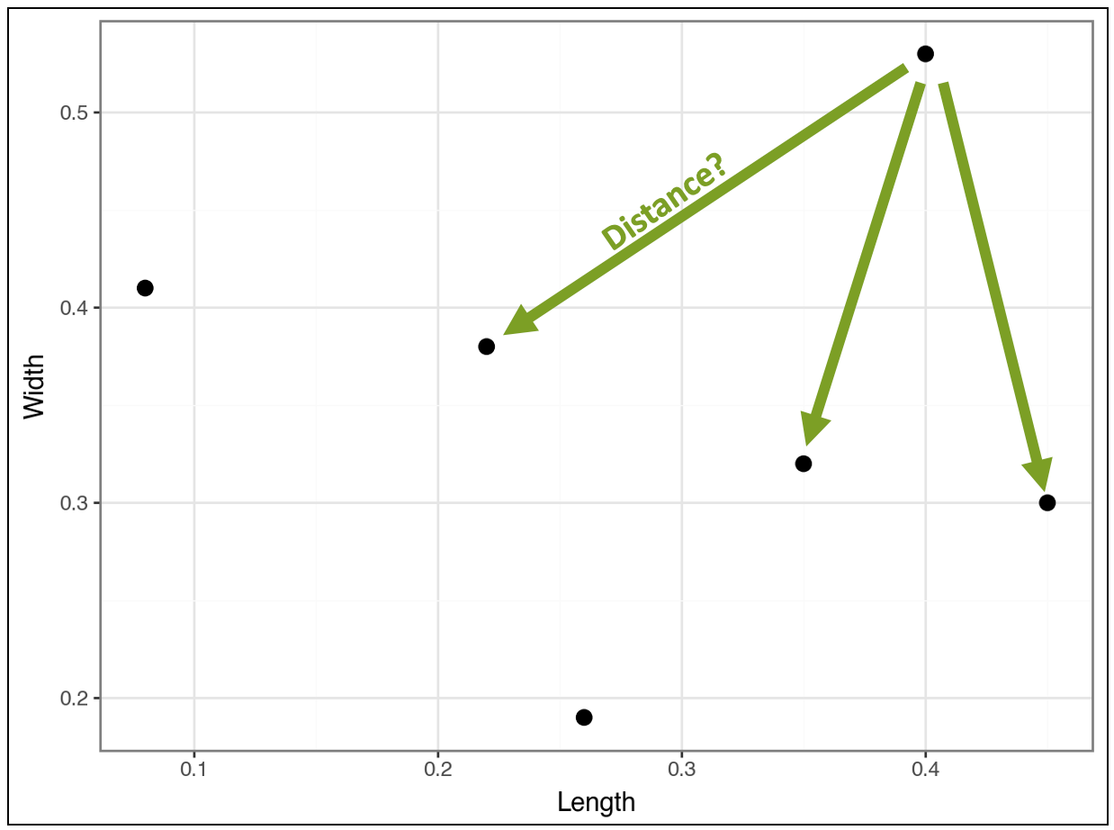
Compare the above distances to the distances for the point below:
And compare the following:
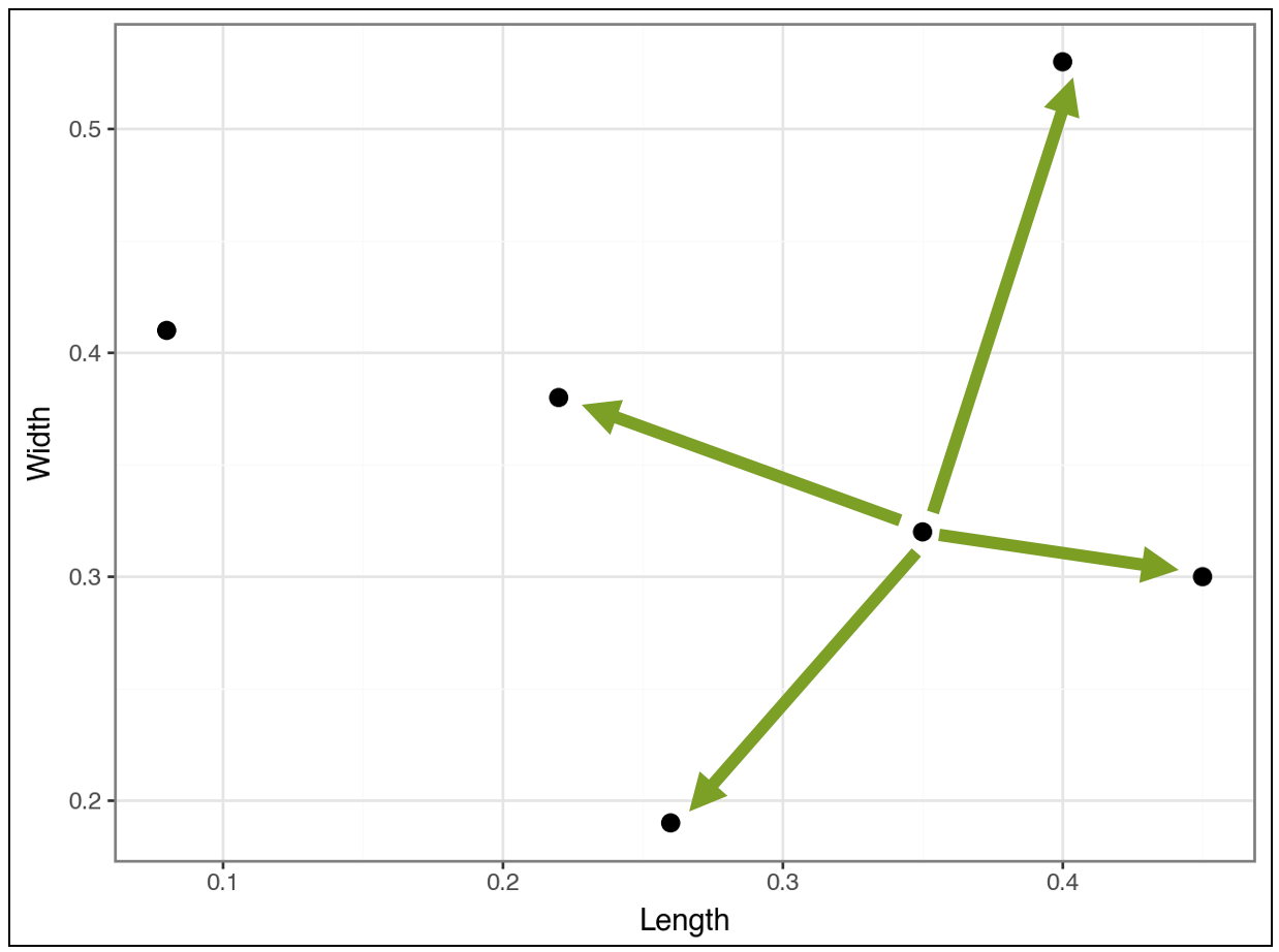
The algorithm continues in this fashion, calculating distances, to cluster the most similar data points together. The algorithm is greedy, meaning it chooses the best clustering it can find as soon as it can.
This is an important idea.
The clusters found early on may not be the “best” later on. This greediness is necessary for the algorithm to have any chance of running fast enough to be useful.
Greediness is a recurring theme in data science (e.g., decision tree-based machine learning) and works well in practice - so don’t worry! 😁
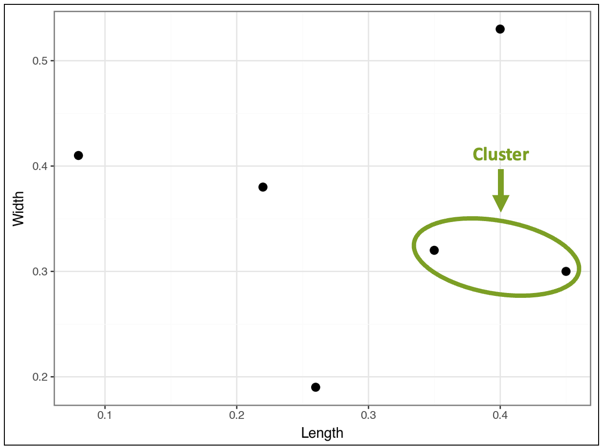
The First Cluster
Based on all the distance calculations, the algorithm greedily finds the first cluster:
This distance comparison process continues, and the algorithm greedily finds a second cluster:
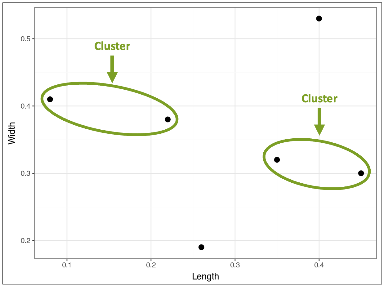
At this stage, the visualization above shows that four products belong to clusters, while two do not, based on the distances.
Clusters as Data Points
Now, here’s the interesting thing.
Conceptually, the algorithm treats found clusters like individual data points.
For example, in the visualization above, the distance between the top-right data point will be calculated for each cluster, not for individual data points within the clusters.
A future tutorial will teach you the strategies used to make this happen. But for now, it’s not necessary.
Next, the algorithm considers the distances between clusters and any data points that do not belong to clusters.
This is where something interesting happens.
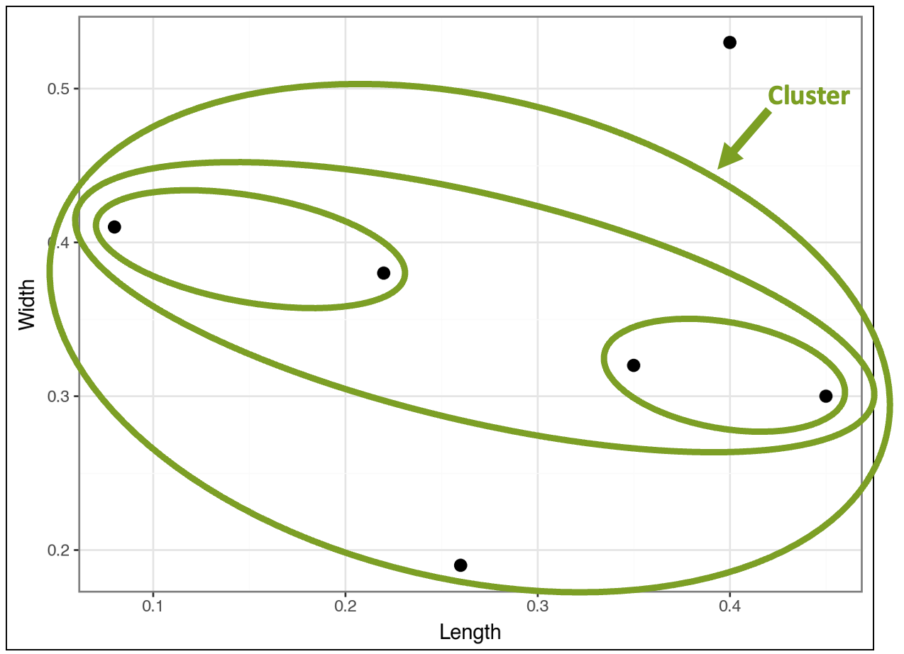
The algorithm finds that the clusters are closer to each other than the two data points that don’t belong to any clusters. In response, the algorithm clusters the clusters:
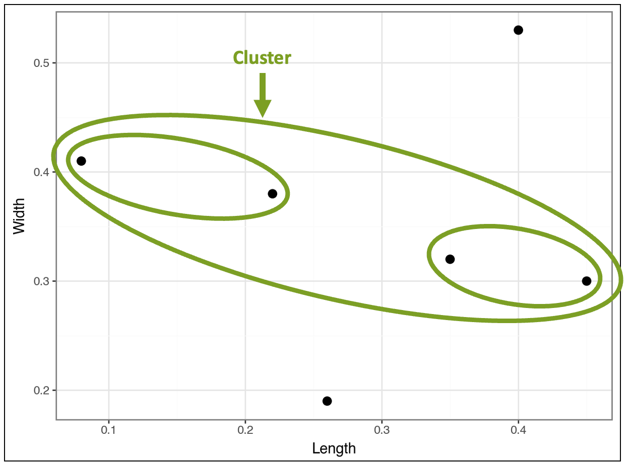
The visualization above demonstrates how the algorithm constructs the hierarchy of nested clusters. Looking at the data points provides intuition about what’s happening:
The two unclustered data points have relatively large or small Length and/or Width values.
The cluster of clusters contains the four data points with more typical values of Length and Width.
The contained cluster on the left has two data points with relatively low Length values and relatively high Width values.
The contained cluster on the right has two data points with relatively high Length values and relatively low Width values.
This is how the algorithm mines a taxonomy (i.e., a hierarchy) directly from the data.
However, the algorithm isn’t complete yet because it still needs to cluster all the data. So, the algorithm compares the cluster of clusters to the two remaining data points and finds the following:
At this point, there's only one last cluster that includes all the data points:
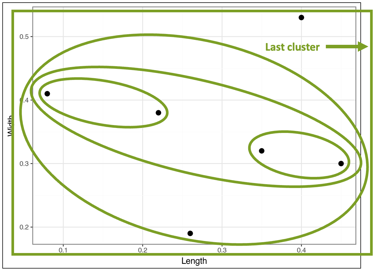
In the visualization above, I drew the last cluster using a rectangle simply because it fit better. 🤣
Ready to learn more?
My Cluster Analysis with Python online course will teach you how to use k-means and DBSCAN clustering in a weekend.
Mapping It Back to the Data
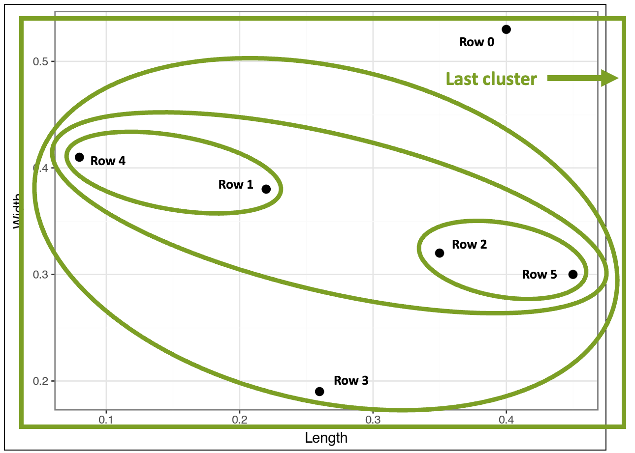
While going through the images above step-by-step helps to build your intuition, the final result is cluttered and hard to read (I added the row numbers from the dataset for context):
This is where a special kind of visualization known as a dendrogram comes in handy:
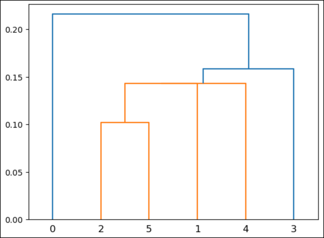
In the above dendrogram, the numbers along the bottom correspond to the rows of the dataset (i.e., Python starts counting from 0).
When using real (i.e., much larger) datasets, these numbers typically correspond to the number of rows per cluster.
Here’s what the dendrogram shows:
Rows 2 and 5 are a cluster.
Rows 1 and 4 are a cluster.
There’s a cluster that contains the previous two clusters.
There’s a cluster that contains all the above clusters and row 3.
There’s one last cluster that contains all the above clusters and row 0.
The heights of the lines in the dendrogram indicate the similarity between clusters. For example, the cluster of rows 2 and 5 is the shortest.
This aligns with what you saw in the previous visualizations: these rows are the closest.
Like most data visualizations, dendrograms break down when the scale becomes large (e.g., many nested clusters). A later tutorial will cover a strategy for optimizing the number of clusters found.
👉 Ready to learn more? Check out Part 3 here.
That’s it for this tutorial.
My next newsletter will continue this tutorial series by teaching you how distances are calculated in agglomerative hierarchical clustering.
Stay healthy and happy data sleuthing!
👩🏫 Ready to Learn More Analytics Skills?
My paid subscribers have access to exclusive monthly live crash courses that include:
PDFs of all slides.
Excel workbooks, code, and data.
Recordings so you can learn on your schedule.
Here are some examples of my live crash courses:


