
Hierarchical Clustering with Python Part 3: Calculating Distance
Honestly, you don't need to be a math genius to understand this.

Are you new to this tutorial series? Check out Part 1 here.
Every clustering algorithm that you commonly use in DIY data science needs some way to calculate the distance (i.e., similarity) between two rows of data.
Euclidean distance is the default method for calculating distance in these algorithms.
Don’t panic! Euclidean distance is a fancy name for something you learned in elementary or middle school - the Pythagorean theorem.
This tutorial will demonstrate how this works using a simple step-by-step graphical approach.
Honestly, you don’t need to be a math genius to understand how this all works.
Setting the Context
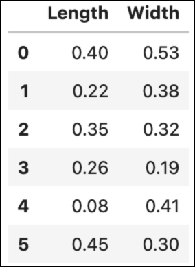
To jog your memory, here’s the hypothetical dataset from the last tutorial:
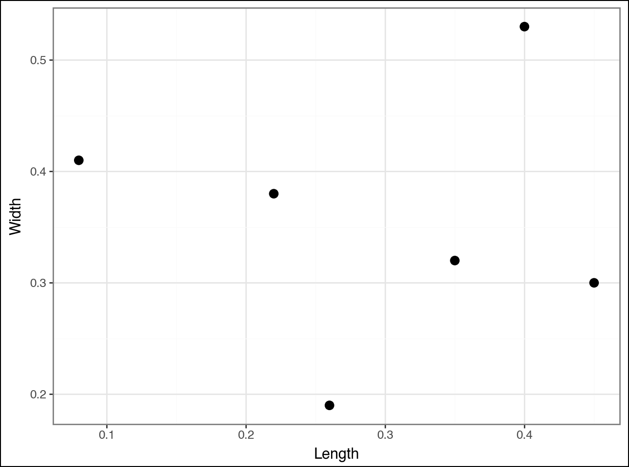
And the scatter plot of the dataset:
As discussed in the last tutorial, the agglomerative hierarchical clustering algorithm calculates distances between all the pairs of data points in the dataset.
The algorithm finds that the following two data points (i.e., rows) are closest and clusters them:
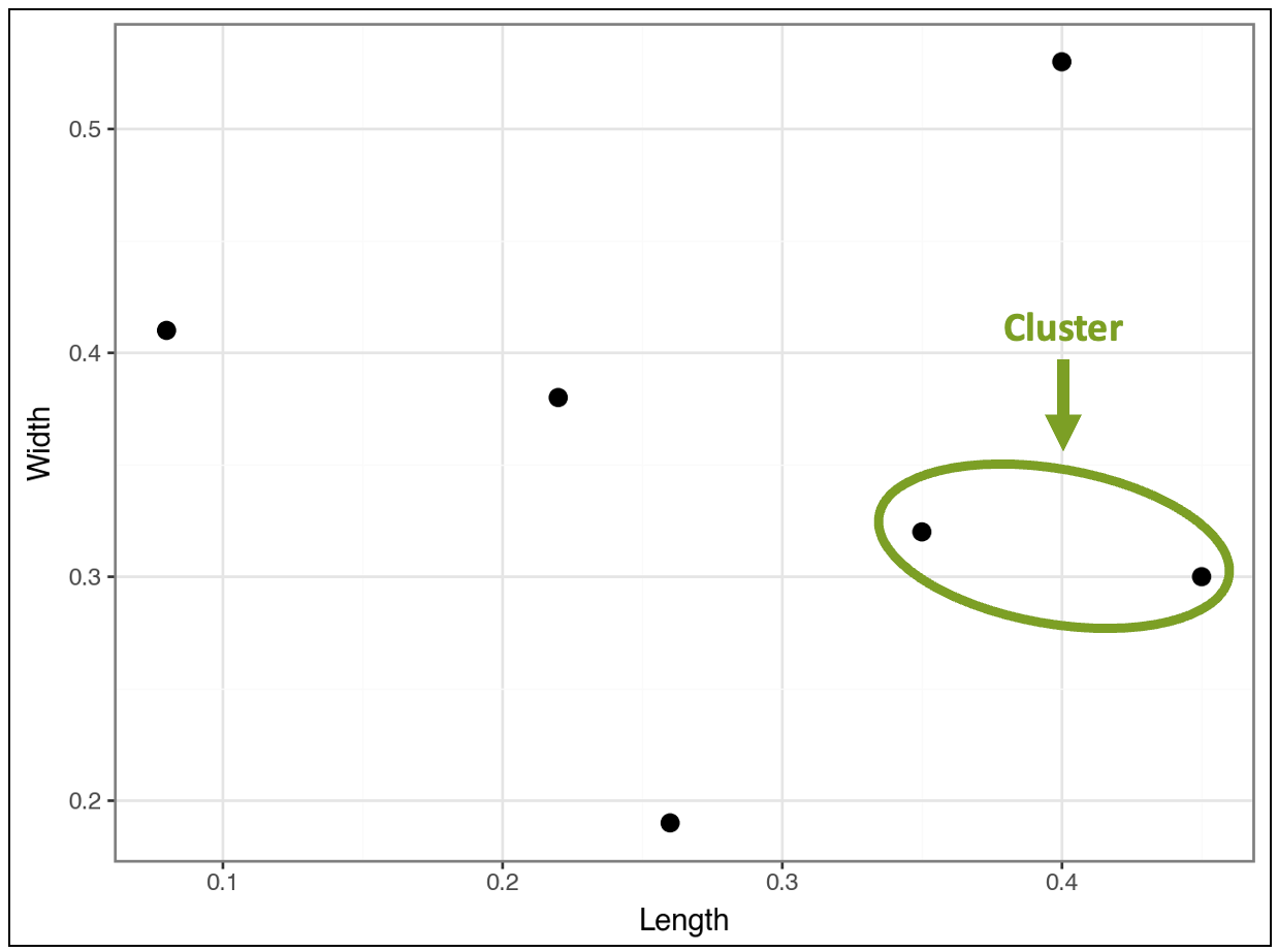
The tutorial will use these two data points to explain Euclidean distance.
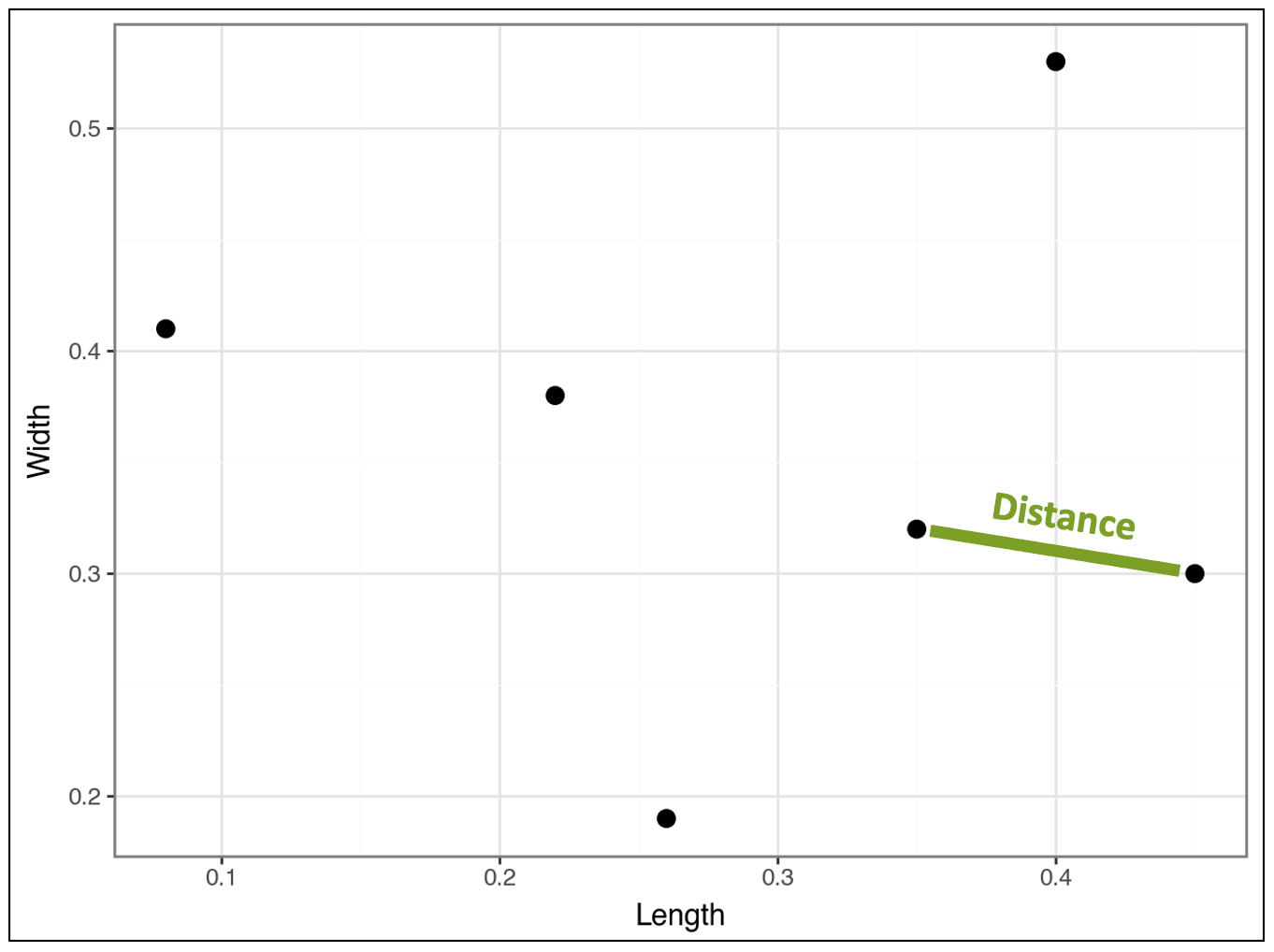
Intuitively, we know the distance between these two data points is represented by the line below:
The Power of the Pythagorean Theorem
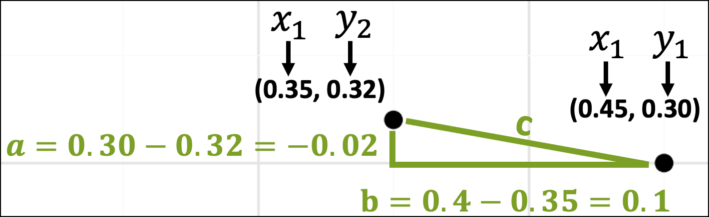
Zooming in on these two data points, we can also imagine them as being part of a triangle with each side of the triangle labeled a, b, and c:
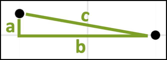
As you might recall from school, the Pythagorean theorem gives the mathematical relationship between the lengths of the sides of the above triangle:
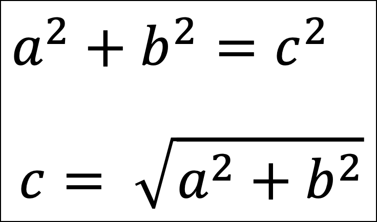
From the above images, we now have a way to calculate the distance between the two data points - it’s the length of side c!
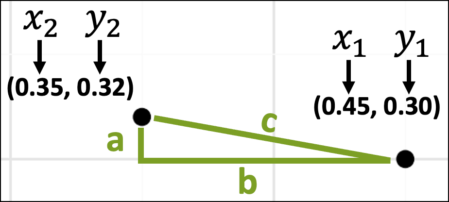
Plugging the data points into the Pythagorean theorem will calculate the distance. To do this, we’ll need the data values:

The above image shows which dataset rows correspond with the data points in the scatter plot. The image also displays the data values for each row.
The next step is to think about these data values in terms of the x-axis and y-axis coordinates:
With the coordinates in place, the lengths of the sides of the triangle are just the differences in the x-axis and y-axis coordinates:
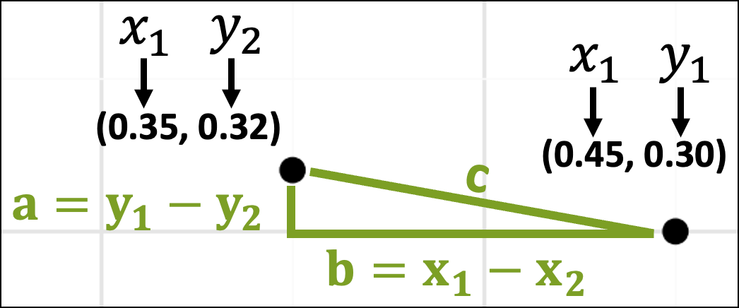
The rest is simple plug-and-chug math:
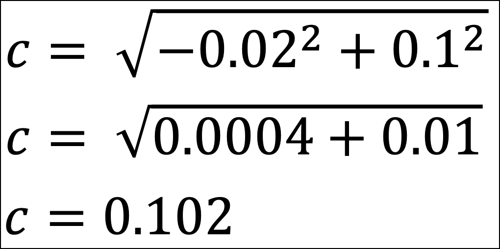
The distance between the Row 2 and Row 5 data points is 0.102.
Easy peasy!
Handling Real-World Datasets
Now, here’s the magic of the Pythagorean theorem.
The Pythagorean theorem is Euclidean distance in two dimensions (e.g., a triangle is a 2D shape). The same ideas behind the Pythagorean theorem scale to more dimensions.
For example, all the visualizations above are 2D. They have an x-axis and a y-axis. Consider a 3D visualization. This adds a z-axis.
As shown above, the calculation uses the differences between the x and y values for the data points. In 3D, this would include a difference for the z values as a third term:

The above pattern scales beyond 3D. In other words, if you have 15 columns in your dataset, there would be 15 different terms under the square root symbol.
The good news is that Python will calculate all this for you automagically.
The important part for you is the intuition of what’s going on with the distance calculation. This is where the Pythagorean theorem helps build your intuition of how clustering determines similarity.
Now you know how agglomerative hierarchical clustering works behind the scenes.
The algorithm iteratively calculates the Euclidean distances between data points and/or clusters to build the taxonomy.
As you might imagine, when your datasets have many columns and rows, your laptop has to do a lot of work performing all the calculations.
The larger your datasets, the longer the algorithm will take to run. However, the time spent increases extremely quickly as you add rows/columns (i.e., there’s a nonlinear relationship between dataset size and running time).
This means that agglomerative hierarchical clustering doesn’t scale well to large datasets. I will cover scaling clustering to very large datasets in a future live crash course.
👉 Ready to learn more? Check out Part 4 here.
That’s it for this tutorial.
My next newsletter will continue this tutorial series by teaching you the Python code to perform your own hierarchical clustering.
Stay healthy and happy data sleuthing!
👩🏫 Ready to Learn More Analytics Skills?
My paid subscribers have access to exclusive monthly live crash courses that include:
PDFs of all slides.
Excel workbooks, code, and data.
Recordings so you can learn on your schedule.
Here are some examples of my live crash courses:


I created my own from scratch that is a combination of nlp and graph. Works very well. I give it away on my blog.